How to Design a Website That Converts Like Crazy


Ezekiel Muoneke
Content Writer
- Blog
- April 26, 2023
- 9:11 pm
You’ve probably heard the term “conversion rate optimization” or CRO before. It’s the practice of improving your website to increase the percentage of visitors who take a desired action, such as buying a product, signing up for a newsletter, or filling out a form.
But did you know that CRO is not only about tweaking your copy, headlines, or buttons? It’s also about how you design your website to make it easy, enjoyable, and persuasive for your visitors.
In this post, we’ll share six design principles that can help you boost your conversion rate by creating a website that appeals to your audience and guides them towards your goals.


1. Use Visual Hierarchy to Emphasize Your Value Proposition
Visual hierarchy is the way you arrange and present the elements on your website to show their importance and relationship. It helps your visitors scan and understand your content quickly and easily.
One of the most important elements to highlight with visual hierarchy is your value proposition: the main benefit or reason why someone should choose your product or service over others.
Your value offer needs to be attractive, precise, and simple. It should provide a response to the question, “What’s in it for me?” Additionally, it should clearly be displayed on your homepage and landing pages, preferably above the fold (the area of the screen that can be seen without scrolling).
To make your value proposition stand out, you can use contrast, size, colour, whitespace, and typography. For example, you can use a large font size, a bright colour, or a bold font weight to draw attention to your headline. You can also use whitespace to create breathing room around your value proposition and make it easier to read.
2. Use Directional Cues to Guide Your Visitors
Directional cues are visual elements that point your visitors towards a specific action or location on your website. They can be explicit, such as arrows, pointers, or lines; or implicit, such as eye gaze, body posture, or shapes.
Directional cues can help you direct your visitors’ attention and focus to your most important elements, such as your call-to-action (CTA) buttons, forms, or testimonials. They can also help you create a sense of flow and movement on your website and lead your visitors through a logical path towards conversion.
For example, you can use an arrow to point to your CTA button and indicate where you want your visitors to click. You can also use an image of a person looking at your CTA button or form to create an implicit cue that influences your visitors’ eye movement.
3. Employ Social Proof to Increase Credibility and Trust
Social proof is the phenomenon where people tend to follow the actions or opinions of others, especially when they are uncertain or unfamiliar with something. It’s based on the assumption that if others are doing or saying something, it must be good or true.
Social proof can be a powerful tool to persuade your visitors to take action on your website. It can help you build trust and credibility with your audience by showing them that others have already tried and liked your product or service.
There are many types of social proof that you can use on your website, such as:
• Testimonials: quotes or stories from satisfied customers that highlight the benefits or results of using your product or service.
• Reviews: ratings or feedback from customers that show their satisfaction level and experience with your product or service.
• Case studies: detailed stories or examples of how customers have used your product or service to solve their problems or achieve their goals.
• Logos: logos of reputable brands or organizations that have used or endorsed your product or service.
• Awards: badges or certificates that show recognition or achievement from authoritative sources.
• Numbers: statistics or data that show the popularity or effectiveness of your product or service.
To make your social proof more effective, you should:
~ Choose social proof that matches your target audience and their needs.
~ Display social proof prominently on your website, especially near your CTA buttons or forms.
~ Use specific and authentic social proof that shows real names, photos, locations, or results.
~ To keep it current and useful, regularly update your social proof.
4. Use Colour Psychology to Evoke Emotions and Actions

Colour psychology can simply be described as the study of colours and how they affect human feelings, behavior and emotions. Different colours can have different meanings and associations depending on the context and culture.
Colour psychology can help you design a website that evokes the right emotions and actions from your visitors. It can help you create a mood and atmosphere that matches your brand personality and values. It can also influence your visitors’ actions and decisions by creating a sense of urgency, curiosity, or trust.
To use colour psychology effectively, you should:
~ Understand the general meanings and associations of different colors and how they vary across cultures and contexts.
~ Know your target audience and their preferences, expectations, and emotions.
~ Choose a colour scheme that matches your brand identity and message.
~ Use contrast, harmony, and balance to create visual interest and hierarchy.
~ Test different colours and combinations to see what works best for your website and goals.
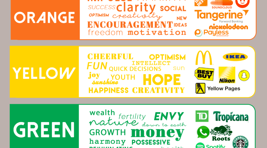
Here are some examples of how different colors can affect your website design and conversion rate:
• Red: Red is a powerful and stimulating colour that can evoke excitement, passion, urgency, or danger. It can be used to draw attention to important elements, such as CTA buttons, headlines, or offers. It can also increase appetite and impulse buying. However, red can also be overwhelming or aggressive if used too much or in the wrong context. It can also signify errors or warnings, so be careful not to confuse your visitors.
• Blue: Blue is a calm and soothing colour that can evoke trust, security, stability, or professionalism. It can be used to create a sense of reliability, authority, or credibility for your website. It can also reduce stress and anxiety and promote relaxation. However, blue can also be cold or distant if used too much or in the wrong context. It can also signify sadness or depression, so be careful not to make your website too gloomy.
• Yellow: Yellow is a bright and cheerful colour that can evoke happiness, optimism, curiosity, or creativity. It can be used to create a sense of warmth, energy, or positivity for your website. It can also stimulate attention and memory and encourage communication. However, yellow can also be irritating or overwhelming if used too much or in the wrong context. It can also signify caution or cowardice, so be careful not to make your website weak.
•Green: Green is a natural and refreshing colour that can evoke growth, health, harmony, or sustainability. It can be used to create a sense of freshness, vitality, or eco-friendliness for your website. It can also stimulate relaxation and healing and promote balance and harmony. However, green can also be boring or stagnant if used too much or in the wrong context. It can also signify envy or greed, so be careful not to make your website too materialistic or competitive.

5. Make Use of White Space to Create Focus and Clarity
White space is the empty space between and around the elements on your website. It’s not necessarily white; it can be any colour that contrasts with the other elements.
White space is an important design element that can help you create clarity and focus on your website. It can help you:
~ Reduce visual clutter and noise
~ Increase readability and comprehension
~ Highlight important elements
~ Create breathing room and balance
~ Guide the eye movement and flow
~ Enhance aesthetics and elegance
To use white space effectively, you should:
• Avoid filling up every inch of your website with content or graphics
• Use adequate margins and padding around your elements
• Use appropriate line spacing and font size for your text
• Use white space strategically to create contrast and emphasis
ENJOYING THE ARTICLE?
Sign up For Our Newsletter
And finally,
6. Use Images and Videos to Engage Your Visitors
Images and videos are powerful visual tools that can help you engage your visitors on your website. They can help you:
~ Capture attention and interest
~ Communicate your message more effectively
~ Show rather than tell your value proposition
~ Evoke emotions and feelings
~ Build trust and credibility
To use images and videos effectively, you should:
• Choose relevant and high-quality images and videos that match your brand identity and message
• Optimize your images and videos for speed and performance
• Use captions, alt text, titles, and descriptions
• Place your images and videos strategically on your website to support your content
• Test different images and videos to see what works best for your website and goals


In the end, designing a website that converts like crazy is not a matter of luck or intuition. It’s a matter of understanding how design affects human psychology and behavior. By applying these six design principles to your website design process, you can create a website that appeals to your audience’s emotions, motivates them to take action, and guides them towards your goals.
Remember, design is not only about aesthetics. It’s also about functionality and usability. So, what are you waiting for? Start designing your website today and watch your conversion rate soar!


